Developing Norm
Norms are subjective, neither stable nor static.
July 29, 2024, Development

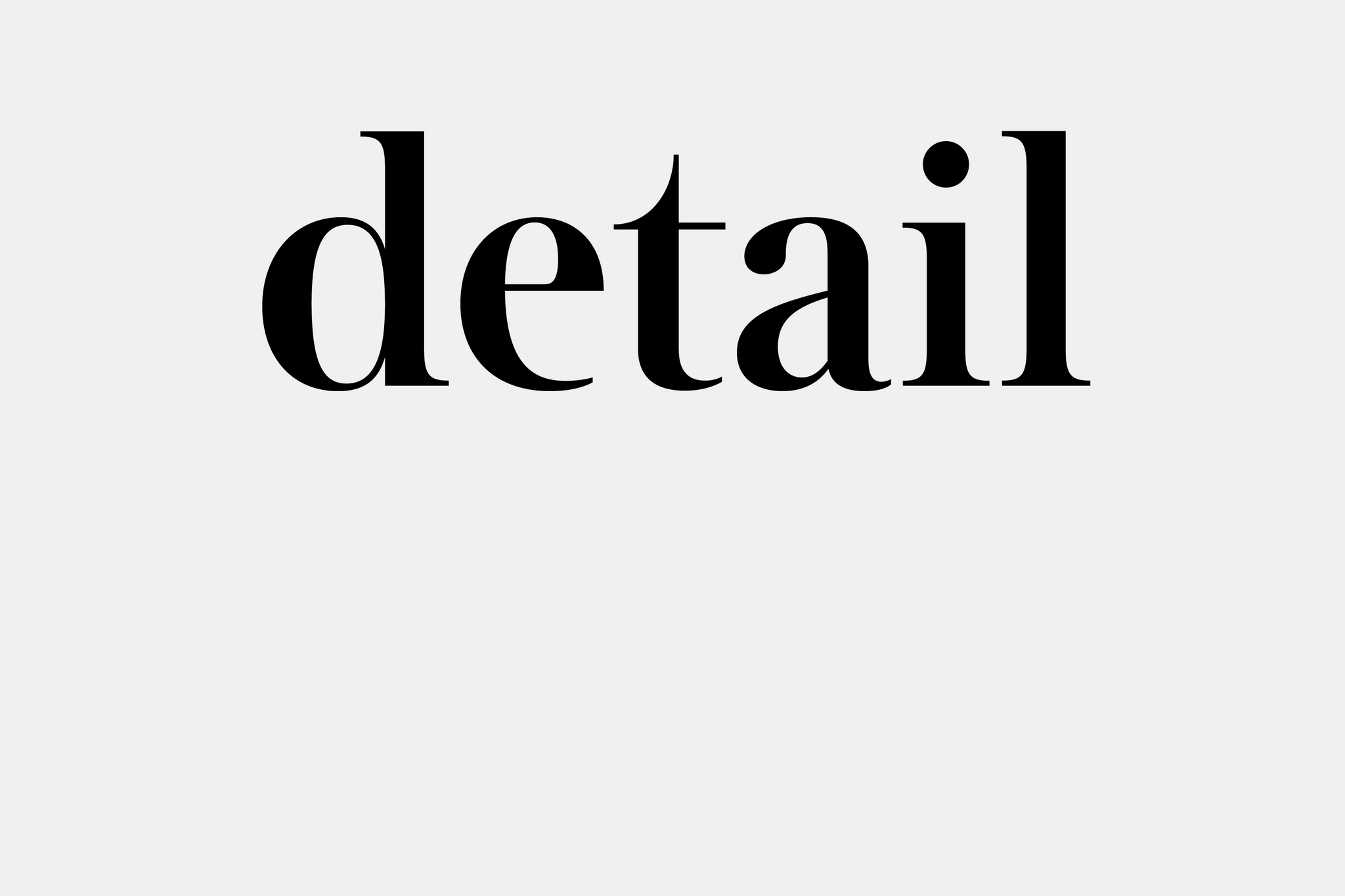
The mid-20th century in typographic history was a turning point with the introduction of neo-grotesques, a genre that continues to have a strong influence on our contemporary visual landscape. Early sans serif typefaces were referred to as grotesques, a term in response to their jarring, almost repulsive appearance. These limbless, seemingly naked creatures went against the existing norm of serif typefaces with anchors to keep them grounded. With time and intentional use, however, grotesques and their genetic offspring were accepted and normalized — becoming more or less the shared image when we think of the term “sans serif”. The Norm series, led by Makoto Kamimura, is an ongoing study of this modern form. This initial release introduces Norm No. 6, Norm No. 11., and Norm No. 15.

The variations of Norm were first explored and designed in one font file, dwelling as neighbors in the same digital canvas before being packaged as individual files. In the process of designing one character, a range of potential shapes were uncovered. Instead of designing Norm as one typeface with multiple alternates, we chose to create Norm as a collection of individual typefaces.

Alternates may be considered secondary to the default, taking the role of a stylistic understudy. They can imply the designer’s prescription of their normal or standard. The differences across Norm, although slight and subtle, are significant. In place of tucking alternates into the back of the font file, these differences have their own purpose, demanding them to live as individual fonts. Within the differences, individuals define their own normal.
At first glance, the typefaces look almost identical. As kernels of sand on a shore appear uniform in size, shape, and color, a closer look reveals their origin stories — each once a distinct rock that was later polished by water and smoothed by time. While the Norm typefaces share a collective expression of the modern grotesque, each variation has its own subtle and not-so-subtle nuances that produce its individual tone.

Similarly, while the Norm typefaces share a collective expression of the modern grotesque, the development of each typeface was grounded in different aesthetic precedents. There is a feeling of uniformity for the entire collection, while the subtle nuances highlight each typeface’s individuality. The variations do not follow a linear narrative, rather their numbering system is simply a way to identify them.

While developing Norm, we referenced as many grotesque and sans serif typefaces as possible. Since the original releases of Akzidenz Grotesk (1898), Helvetica (1957), and Univers (1957), variations by multiple manufacturers continued to be produced due to changes in media: from metal type to photo type to digital type. New variations also resulted from different business and licensing relationships, as well as revisions made from foundry to foundry.
In other words, while at the level of semantics, these typefaces were updated and released under the same name, at the level of aesthetics, each one was reborn with a slightly new identity. Univers was first planned as a complete family in mind, but Helvetica expanded as time went on and was revised under several foundries. While the differences may have been inconspicuous, the reality that there are designers who are particular over their preferred variation of Univers or Helvetica implies otherwise. Which version do we each see when we hear their name? What visual might we get when we average our individual imaginations?

With this first launch we introduce Norm No. 6, Norm No. 11, and Norm No. 15.
Norm No. 6 is the first release of this series. Gentle curves and airy counters give the characters a sense of ease. This relaxed posture contrasts with textured negative spaces produced by irregular cuts, where finials are shaved at an angle, rather than parallel to the baseline. The sloping leg of the capital R is a gesture found in predecessors such as Helvetica and Univers, but No. 6’s is more laid-back and sturdily leaning into itself. Characters with tails and descenders, such as t and y, gently extend and curve. A similar pace to Helvetica-like lettering in the 1960s, these shapes are not in a rush, but linger for a little before completing their gesture. These details altogether create a texture and friction that give the letters a sense of self-awareness and humility.

Norm No. 11 in comparison has a temperament that is more straightforward and decisive. Finials are cut horizontally to run parallel to the baseline. Among this initial trio, No. 11’s character widths are the widest to compensate for its geometric skeleton. Letters have a wider stance and stretch to fully express their form. Rounded strokes swell and inflate with negative space, while linear strokes collide and intersect. Soft curves and direct lines are equally emphasized. Gestures that extend, such as the leg of the capital R, tail of lowercase y, as well as the lowercase t, are declarative and to the point. There is little time and space for frills.

Norm No. 15 results from a close study of the Univers series. In a similar spirit, characters follow oval silhouettes molded by flat exteriors and squarish counterspaces. The capital G is completed with one movement, accented with Univers’s signature spur and defined jawline. Narrow widths compress space, causing letters with tight apertures, like c, e and g, to appear as though they are almost folding into themselves. No. 15’s lowercase t also stays close to the x-height, creating a contrast between upper and lowercase lengths. Playing with space while balancing softness and rigidity, No. 15’s quietly eccentric characters follow a subtle and syncopated rhythm.
One character that is consistent across these three variations is the capital Q. While this letter is usually a wild card for designers to come up with playful variations, our personal preference is to keep the shape as simple as possible for the time being. Whether or not the form changes in the future is still undecided. This question, among others, will naturally be revisited when designing other variations for Norm in the future.

When sans serifs first debuted, they were far from the norm. Their place in the world was contested on moral grounds. Today, the diversity of typefaces as a medium reflect the lengths designers will go to visualize individual tastes and preferences. Our typefaces are ones we use in our design practice at Kamimura & Co., which requires them to be flexible, durable, and robust to be applied in diverse contexts.
To create something new is to orient oneself toward the future. The future, in its abstraction, might make us anticipate and envision a seismic change. But what we actually experience are the small, incremental changes unfolding everyday in the ongoing present. Change is a process, and only something we can point to in retrospect. This concept is Norm’s raison d'être: to subtly enter the current of the graphic and visual production. Instead of expecting Norm to be easily recognized everywhere, as it is not a typeface that is meant to make a statement, the hope is that new design can emerge and be expressed with its use over time.
The premise of Norm began with a simple question: What is normal? We envision that each release will illuminate our understanding and invite discussion. The Norm Collection, rather than our universal answer, is a visual prompt for individuals to define their norm on their own terms, no matter how specific, subtle, or unconventional.

July 29, 2024, Development

